
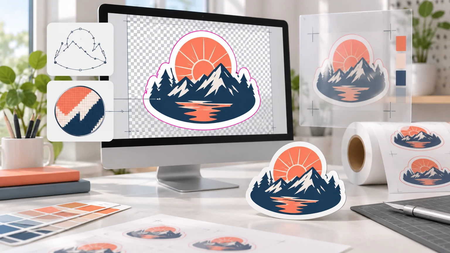
TLDR: CustomStickers artwork file preparation starts with a genuine vector file when one is available. Otherwise, use raster artwork with enough pixels to deliver 300 ppi at the ordered size. Decide whether transparent pixels are intentional, keep essential details away from the cut, and inspect the proof before approving production.
The important part of CustomStickers artwork file preparation is checking the image at its final physical size. A large-looking image on screen can still be too small for print, while a clean vector logo can scale without the same pixel limitation. CustomStickers recommends high-resolution PNG or JPG files as well as SVG, AI, and EPS vector files, and it also accepts self-prepared PDF artwork. Its published guidance recommends 300 ppi at full size for raster images.
The pre-upload checklist
- Choose the sticker’s final dimensions, remembering that the ordered size refers to its longest side.
- Use SVG, AI, or EPS when you have genuine vector artwork. Do not assume an image becomes vector simply because it was placed inside an Illustrator file.
- For raster artwork, confirm that its pixel dimensions provide approximately 300 ppi at the intended print size.
- Use PNG when you need raster transparency. Use a high-quality JPG only when an opaque background is intentional.
- Decide whether the finished design needs a border or should visually run to the cut edge.
- Keep text, faces, QR codes, thin outlines, and other critical details safely inside the cut.
- Check small type and thin strokes at the physical print size rather than judging them only while zoomed in.
- Upload the artwork, review the generated cut line and proof, and request a revision if the size, crop, border, or shape is wrong.
Choose a file format based on the artwork
There is no single best format for every sticker. The right choice depends on whether the source is made from paths, pixels, or a complete production layout.
| Format | Best use | Main check before upload |
|---|---|---|
| SVG, AI or EPS | Logos, lettering and illustrations made from vector paths | Confirm that important elements remain vector and that linked assets or fonts will not go missing. |
| PNG | Raster illustrations, logos or images that require transparent pixels | Verify the pixel dimensions at final size and inspect the transparent edge for unwanted halos. |
| JPG | Opaque photos or flattened artwork without transparency | Use a high-quality export and check that compression has not created blocks or ringing around edges. |
| Intentionally prepared production artwork or mixed vector-and-raster layouts | Inspect the exported PDF for correct page size, crop, transparency and embedded content. |
CustomStickers says it can work with virtually any format, but it specifically recommends high-resolution PNG or JPG artwork and SVG, AI, or EPS vector files. PDF is also an option for self-prepared artwork. If you are deciding between two common handoff formats, this guide to PDF versus PNG for printing explains the practical differences.
Use vector artwork when possible for logos, geometric illustrations, borders and lettering. Vector paths are mathematically defined, so they can be resized without the pixelation associated with raster images. A photograph, textured painting or flattened digital illustration remains raster artwork and must contain enough real pixels for the requested size.
Calculate resolution at the ordered size
CustomStickers recommends 300 ppi at full size and warns that very low-resolution images may still print grainy even when some enhancement is possible. It also defines the selected sticker size by the artwork’s longest side. That longest-side rule matters for irregular die-cut shapes: decide the ordered physical size before evaluating the image resolution.
Use these calculations for raster artwork: required pixels = printed inches × 300, and effective PPI = pixel dimension ÷ printed inches.
| Longest printed side | Pixels for 300 ppi | Example |
|---|---|---|
| 2 inches | 600 pixels | A 600-pixel-long image provides 300 ppi when printed 2 inches long. |
| 3 inches | 900 pixels | A 900-pixel-long image provides 300 ppi when printed 3 inches long. |
| 4 inches | 1,200 pixels | A 1,200-pixel-long image provides 300 ppi when printed 4 inches long. |
Apply the same calculation independently to both dimensions. For example, artwork that will print at 3 × 2 inches should ideally measure 900 × 600 pixels for 300 ppi. If that file measures only 600 × 400 pixels, it provides 200 ppi at the same physical size.
Changing a file’s PPI metadata from 72 to 300 does not create missing detail. If the pixel dimensions remain unchanged, you have only changed the proposed relationship between pixels and inches. Resampling can create additional pixels, but it cannot reliably reconstruct fine lettering, clean facial features or sharp logo edges absent from the source. For a weak original, rebuild vector elements or obtain a larger source instead of relying on a metadata edit. The same resolution check is useful when reviewing AI-generated artwork for print problems.
Handle transparency intentionally
A transparent background and a clear sticker material are different decisions. Transparency is a property of the artwork file; clear vinyl is the physical material selected for the order.
A PNG can preserve transparent pixels, making it useful for detailed raster logos and icons that should not have a rectangular background. Adobe’s PNG export documentation confirms that PNG supports transparency. Before exporting, inspect the design over both light and dark temporary backgrounds. This can reveal pale fringes, accidental semi-transparent pixels and leftover background fragments.
Do not use transparent pixels merely because the design looks tidy in your editor. Decide what should physically appear around the printed artwork. On an ordinary white sticker, transparent file areas can help define the design’s shape or border. They do not automatically turn the product into a clear sticker.
For clear stickers, CustomStickers says transparent artwork areas remain clear by default. It also cautions that colors on clear material can appear lighter than they do on screen because of the translucent ink and material, including in applications involving white ink. Review the differences between clear stickers and white vinyl stickers before ordering if opacity, surface color or background visibility affects the design.
If the job requires a specific white-ink treatment, ask CustomStickers for job-specific setup guidance. The available instructions do not establish a complete layer-naming or white-ink separation convention, so inventing a special layer name or spot color would introduce unnecessary production risk.
Plan the border, bleed and cut edge
In general print terminology, bleed is artwork extended beyond a trim boundary so minor cutting variation does not leave an unintended unprinted edge. Adobe provides a useful explanation of bleed and trim marks for conventional print layouts. Sticker production can use a different file and proofing workflow, so do not automatically add a generic bleed measurement without checking the provider’s instructions.
For a visible border
If the artwork includes a deliberate printed border near the cut, CustomStickers calls for at least 0.05 inch between the design and cut line. Very thin or uneven borders can make small shifts look more obvious, so a wider border may be visually safer even when a narrower one meets the published minimum.
For color running to the edge
CustomStickers describes a full-bleed workflow in which it brings the cut line inward by approximately 0.03 inch and advises keeping critical elements away from the edge. Treat that figure as a description of its workflow, not as a universal instruction to add exactly 0.03 inch around every uploaded file.
Extend background color or nonessential imagery far enough to support the intended edge treatment, but move anything that must survive—small text, a face, a QR code, a thin frame or an important logo feature—farther inward. See why sticker cut lines matter for a closer look at the relationship between shape, borders and safe placement.
For a custom shape
You normally do not need to create a cut line. CustomStickers says it automatically adds one, shows it during proofing and allows revision requests before production begins after approval. Advanced Illustrator users may instead supply a separate vector cut path with the artwork. Because the published guidance does not specify a required spot-color name, stroke treatment or overprint convention, do not guess at those settings. Use the automatic cut line or request current instructions before building a custom production path.
Check type, lines and small details at actual size
CustomStickers publishes a minimum line-weight recommendation of 0.5 pt, identifies 4 pt as its smallest type size and recommends 6 pt type for readability. These numbers are useful floors, not guarantees that every typeface or design will read equally well.
A condensed font, reversed-out lettering, textured background or low-contrast color pairing may need larger text. Thin script strokes can also fall below the line recommendation even when the nominal font size looks adequate. View the artwork at approximately its physical size, print a paper mockup when practical, and ask whether someone can recognize the design without zooming.
Give QR codes and other machine-readable elements generous space and test them from a physical-size mockup. Their success depends on more than nominal resolution: contrast, surrounding clear space, final size, surface and cut placement can all matter. Avoid placing one close to an irregular edge simply because it fits on the digital canvas.
Worked example: a 3-inch die-cut logo
Suppose a logo sticker will measure 3 inches on its longest side. Start with the original vector logo if available. If the only source is raster, the longest dimension should be at least 900 pixels to meet the 300 ppi recommendation at 3 inches. Check the shorter dimension using the same formula rather than assuming the longest side settles everything.
- Set the intended longest side to 3 inches.
- Use the vector original, or confirm that a raster original has at least 900 pixels along that side.
- Remove the background only if those pixels are genuinely meant to be transparent.
- Decide whether the design needs a visible border or should print toward the cut edge.
- Move lettering and essential logo features comfortably inside the expected cut.
- Check that strokes and lettering remain readable at the physical size.
- Upload the file through CustomStickers.com and select the intended sticker dimensions and material.
- Inspect the proof for overall size, border width, crop, orientation and cut-path shape before approving it.
The proof is the final placement check, not a formality. CustomStickers states that customers can review the automatically added cut line and request revisions before production begins after approval. Zoom in to catch rough paths and background remnants, but also zoom out or print the proof at scale to judge the sticker as a small physical object.
What to inspect in the proof
- The proof dimensions match the intended longest side.
- The cut path follows the correct silhouette without creating awkward spikes, narrow notches or missing areas.
- A white or colored border is intentional and visually even.
- Full-bleed artwork reaches the expected cut edge without sacrificing critical content.
- No text, faces, QR codes or thin outlines sit uncomfortably close to the cut.
- Transparent areas are actually meant to remain unprinted.
- The selected white or clear material supports the intended appearance.
- The proof has not introduced an unexpected crop, rotation or background.
- Any requested custom cut path matches the design rather than an obsolete version of it.
Prepare the file, then trust the proof—not the zoom level
A dependable sticker file begins with the correct physical size, enough source resolution, an appropriate format and an intentional background. Vector originals are the cleanest choice for path-based logos and lettering. Transparent PNG is useful for raster art that truly needs transparency, while JPG suits opaque raster artwork. PDF can work when it has been deliberately prepared and checked as a production handoff.
The next step is straightforward: run through the checklist, calculate effective PPI at the ordered size, protect essential details from the cut, and upload the best source file available. Then use the proof to confirm the border, crop and cut path. Request a revision whenever the proof does not represent the physical sticker you intend to receive.