
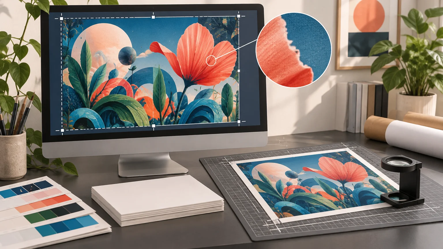
TLDR
A reliable AI generated art print quality check has six parts: start with the highest-resolution source, set the final crop, calculate effective PPI at the intended print size, inspect the image at 100% magnification, follow the printer’s file requirements, and order a proof when defects would be expensive to discover later. Do not assume that changing a file to “300 DPI” creates detail. If the image is too small or contains malformed anatomy, text, edges, or patterns, print smaller, retouch it, regenerate it, or upscale it—and inspect it again afterward.
AI artwork can look excellent on a phone while failing as a large print. A screen shrinks the image, hides fine defects, and may display it with more brightness and contrast than the final material can reproduce. Printing enlarges weak edges, repeated textures, noisy gradients, invented lettering, and inconsistent details. The useful question is not simply “Is this image high resolution?” It is “Does this exact crop contain enough clean, believable information for this physical size?”
The 60-second AI generated art print quality check
- Locate the original downloaded or exported image—not a screenshot, messaging-app copy, or social-media download.
- Choose the actual print dimensions and orientation.
- Apply the final aspect ratio and crop before judging resolution.
- Divide the remaining pixel dimensions by the corresponding print dimensions in inches.
- Inspect important areas at 100% magnification, including faces, hands, lettering, edges, gradients, and repeated patterns.
- Classify the file: ready to print, suitable at a smaller size, repairable, worth upscaling, or better regenerated.
This short process separates two different problems. Resolution tells you how densely the available pixels will be printed. Visual inspection tells you whether those pixels contain convincing artwork. A file can meet a 300 PPI target and still have distorted fingers or broken lettering; another can fall below 300 PPI yet remain acceptable at a reasonable viewing distance.
Calculate effective PPI instead of trusting the DPI label
For a raster image, printable size comes from its pixel dimensions relative to its physical dimensions. Effective PPI equals pixels divided by inches. Calculate both directions and use the lower result as the conservative quality figure. Adobe describes 300 PPI as a typical high-quality print target, but it is a planning target rather than a universal requirement. With resampling disabled, changing the resolution field reallocates the same pixels over a different physical size; it does not create new image detail.
Use these formulas: horizontal PPI = cropped pixel width ÷ print width in inches; vertical PPI = cropped pixel height ÷ print height in inches. For example, a final 2400 × 3000-pixel crop printed at 8 × 10 inches provides 300 PPI in both directions.
| Print size | Pixel dimensions at 300 PPI | What to check |
|---|---|---|
| 4 × 6 inches | 1,200 × 1,800 pixels | Confirm that the image can use a 2:3 crop. |
| 8 × 10 inches | 2,400 × 3,000 pixels | Check whether cropping to 4:5 removes important content. |
| 11 × 14 inches | 3,300 × 4,200 pixels | Inspect faces, linework, and fine textures carefully. |
| 16 × 20 inches | 4,800 × 6,000 pixels | Expect weak synthetic details to become easier to see. |
These dimensions are useful 300-PPI planning targets, not mandatory specifications for every process. Epson’s large-format photo guidance identifies 180 PPI as a minimum for a high-quality enlargement in its workflow and 300–360 PPI as ideal in its example. The appropriate threshold still depends on the printer, process, substrate, viewing distance, and image content. Review the large-format resolution guidance from Epson as one provider-specific reference, then follow the requirements of the company producing your print.
Worked example: a 2,000-pixel image
A 2,000-pixel-wide image can print about 6.67 inches wide at 300 PPI because 2,000 ÷ 300 = 6.67. At 180 PPI, the same width reaches about 11.11 inches. That arithmetic does not guarantee equal perceived quality: the larger version spreads the same source pixels over more paper and may expose softness or artifacts.
A 2,000 × 2,000 square image also does not naturally fit an 8 × 10 rectangle. Cropping it to a 4:5 ratio produces a 1,600 × 2,000-pixel file, yielding 200 PPI at 8 × 10 inches. Checking only the uncropped square would overstate the usable resolution. Terms such as “2K” and “4K” are similarly incomplete unless you know the exact pixel width, height, and final crop.
Set the crop before evaluating sharpness
Print sizes use different aspect ratios. A square AI image, a 2:3 poster, and an 8 × 10 print cannot share one crop without trimming, borders, or added canvas. Cropping after the resolution calculation can remove both pixels and important visual elements.
Duplicate the source, set the intended aspect ratio, and position the crop. Keep faces, lettering, signatures, and critical details away from trim and safe-area boundaries specified by the printer. If you use generative expansion to fill missing edges, inspect the new material just as closely as the original. Expansion can introduce doubled objects, wandering lines, mismatched shadows, or repeated texture.
If the artwork began as a smaller online graphic, the crop and rebuild logic in turning a screen graphic into a print-ready asset can help you decide what must be reconstructed rather than merely enlarged.
Inspect AI-specific problems at 100% magnification
View the file at 100%, where one image pixel is represented by one screen pixel. This is not a literal preview of the physical print size, but it is a practical way to find defects hidden by fit-to-screen scaling. Move around the whole canvas rather than checking only the focal point.
- Faces and hands: look for asymmetrical eyes, merged fingers, extra joints, broken jewelry, and inconsistent teeth or pupils.
- Text and symbols: read every character. Decorative pseudo-lettering may look plausible from a distance but become obviously malformed in print.
- Architecture and geometry: follow railings, window grids, horizons, frames, wheels, and perspective lines to see whether they bend or terminate incorrectly.
- Repeated textures: inspect hair, foliage, fabric, scales, crowds, bricks, and ornamental patterns for cloned or melting sections.
- Edges and halos: check around figures and high-contrast objects for bright outlines, smeared boundaries, or fuzzy cutout effects.
- Detail consistency: compare equally important areas. One eye, hand, product edge, or building may be sharply described while its counterpart dissolves into noise.
- Gradients and shadows: look for banding, blotchy dark regions, abrupt tonal steps, and lighting that changes direction without a reason.
- Trim zones: verify that essential content is not close to an edge that will be cut, wrapped, or hidden by a frame.
Inspect at the approximate intended viewing distance as well. A tiny flaw visible only while zoomed in may not matter on a wall print, while malformed text or facial features can remain distracting from across a room. The 100% view finds candidates; project context determines which ones require repair.
Choose between printing smaller, retouching, regenerating, and upscaling
Print smaller when the composition is sound and the main limitation is pixel count. This is the safest response because it increases effective PPI without inventing new information.
Retouch when defects are local and understandable: a small halo, stray object, isolated texture glitch, minor edge problem, or replaceable lettering. Rebuild important text as real type rather than trying to preserve generated letterforms.
Regenerate when the central subject is structurally wrong. Upscaling a malformed hand, impossible staircase, inaccurate product-like detail, or unreadable title usually produces a larger version of the same conceptual failure. Fix the content before increasing dimensions.
Upscale only after the composition, crop, and repairs are settled. Some generation workflows provide an upscale action, but available output resolution varies by model and workflow. More pixels do not prove that synthesized details are accurate. Inspect the enlarged result again at 100%, especially around eyes, linework, text, and repeated textures.
Prepare a print master without damaging the original
Keep the original source untouched. Save a separate working master containing the final crop and non-destructive edits where possible, then produce a printer handoff file from that master. Use clear names such as artwork-title_8x10_print_v03 rather than overwriting a file called final.
Ask the printer for its required dimensions, bleed, safe area, file format, maximum file size, and color-profile instructions. JPEG, PNG, TIFF, and PDF can all be appropriate in particular workflows, but no format is automatically correct for every product. Do not convert every file to CMYK by habit; use the profile and workflow requested by the printer.
The Library of Congress notes that a specified color space is preferable to an unknown one and that embedded ICC profiles support color management. It identifies sRGB as a practical default when another managed workflow has not been arranged. The practical lesson is to preserve profile information and avoid handing off an untagged mystery file. Review the Library of Congress still-image format guidance for broader preservation and color-space context.
Create a separate web copy rather than shrinking or compressing the print master. If another person or vendor needs the production artwork, use a transfer method that preserves the original file instead of sending it through a service that may compress images. The checklist in sending high-resolution artwork to a printer covers that handoff stage in more detail.
Order a proof when the final print is costly or unforgiving
A small test print or full-size detail proof is worthwhile when the order is large, the material is expensive, or the image depends on faces, fine linework, dark gradients, subtle colors, or heavily enlarged synthetic texture. A cropped detail printed at final scale can reveal problems that a reduced whole-image proof hides.
Evaluate the proof under the kind of lighting in which the finished work will be displayed. Check shadow detail, skin tones, edge clarity, gradient smoothness, and whether artificial textures feel believable at the expected viewing distance. A proof can also help you evaluate production choices before exploring broader printing resources for the finished project.
Final pre-order checklist
- The file is the highest-resolution original available.
- The crop matches the final print’s aspect ratio.
- Effective PPI has been calculated from the cropped pixel dimensions.
- Faces, hands, text, geometry, textures, gradients, and edges have been inspected at 100%.
- Repairs were completed before upscaling, and the upscale was inspected again.
- Dimensions, bleed, safe area, file format, and profile match the printer’s instructions.
- The print master and smaller web copy are separate files.
- A proof has been ordered when the cost or visual risk justifies it.
Treat print quality as a workflow, not a DPI setting
The best next step is simple: duplicate your highest-resolution source, apply the final crop, and calculate effective PPI before editing anything else. Then inspect the actual pixels and decide whether to print smaller, repair, regenerate, or upscale. A metadata label cannot rescue weak artwork, but a disciplined file workflow can catch most expensive surprises before you place the order.