
TLDR
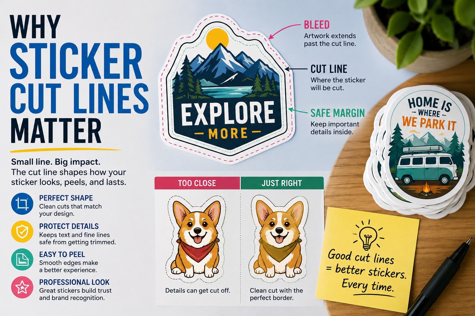
Sticker cut lines show where the sticker will be cut. They affect the final shape, border, peelability, and how polished the sticker looks once printed. Good cut lines keep important details safe, prevent awkward edges, and help the finished sticker match the design you approved. If your artwork has tiny details, thin borders, text near the edge, or a full-bleed background, the cut line matters even more.
A sticker can have great artwork and still feel off if the cut line is wrong.
That is why sticker cut lines matter. The cut line controls the final shape of the sticker. It decides how much white border appears around the design, how close the blade gets to your text, whether tiny details survive production, and how clean the finished sticker looks on a laptop, package, water bottle, mailer, or product jar.
Most people think about color, size, and finish first. Those are important. But the cut line is what turns flat artwork into a physical sticker. If the cut line is too tight, the design can feel cramped. If it is too loose, the sticker can look bulky. If it follows every tiny bump in the artwork, it may be harder to cut cleanly or peel smoothly.
What Is a Sticker Cut Line?
A sticker cut line is the path used to cut the sticker into its final shape.
It is usually shown as an outline around the artwork during the proofing process. On the finished sticker, the cut line is not printed as a visible line. It is simply where the material is cut.
For a circle sticker, the cut line is a circle. For a square sticker, it is a square. For a custom die cut sticker, the cut line usually follows the shape of the artwork with a small border around it.
For example, if you upload a drawing of a coffee cup, the cut line might follow the outer shape of the cup, handle, and steam. If the design is complex, the cut line may be simplified slightly so the sticker looks clean and is easier to peel.
That simplification is not a bad thing. In many cases, it makes the sticker better.
Why Sticker Cut Lines Matter for the Final Shape
The cut line determines what shape the customer actually receives.
This sounds obvious, but it is easy to miss when looking at artwork on a screen. Digital artwork has no thickness. It can include tiny points, delicate hairlines, small gaps, and fine texture. A physical sticker has material, backing paper, adhesive, and a cut edge.
That cut edge needs to make sense in the real world.
A good cut line should:
- Follow the main shape of the design
- Keep small details from getting clipped
- Avoid extremely sharp points when possible
- Leave enough room around thin lines and text
- Create a shape that feels intentional
- Make the sticker easy to peel and apply
For most custom stickers, the best cut line is not the most complicated one. It is the one that supports the artwork without making the sticker fragile or awkward.
If you are ordering die cut stickers, the cut line is especially important because the sticker and backing are cut to the shape of the design. The outside edge becomes part of the look.
Cut Line vs. Border vs. Bleed
These three terms are related, but they are not the same thing.
| Term | What It Means | Why It Matters |
|---|---|---|
| Cut line | The path where the sticker will be cut | Controls the final shape |
| Border | The space between the artwork and the cut edge | Frames the design and protects details |
| Bleed | Extra artwork that extends past the cut area | Helps full-bleed designs reach the edge cleanly |
| Safe margin | Space between important details and the cut edge | Keeps text, logos, and fine details from being trimmed |
A bordered sticker has visible space around the design, often white. A full-bleed sticker has artwork that runs all the way to the edge.
Both can look good. The better choice depends on the design.
A logo sticker often looks clean with a border because the border gives the logo breathing room. A colorful pattern, photo, or background-heavy design may look better full bleed because the image is meant to reach the edge.
The problem comes when artwork is designed like a full-bleed sticker but has no bleed, or when a sticker has a border that is too thin to survive small cutting shifts.
Borders Need Room to Look Even
Thin borders can be risky.
A very narrow border might look perfect in a digital proof, but small cutting variation can make one side look thicker than the other. This is especially noticeable on circles, rectangles, badges, and logo stickers.
That does not mean you should avoid borders. Borders are useful. They can make stickers look cleaner, protect the artwork, and help detailed designs stand out from busy surfaces.
But the border needs enough space to do its job.
Good uses for borders include:
- Logo stickers
- Mascot stickers
- Text-based designs
- Badge shapes
- Stickers with dark artwork
- Stickers placed on colorful surfaces
- Designs with important details near the edge
For small stickers, a slightly thicker border is often better than a tiny one. It gives the cut line room and keeps the sticker from looking accidentally uneven.
Full-Bleed Stickers Need Extra Artwork
Full bleed means the design goes all the way to the edge of the sticker.
This can look clean and modern, but it needs proper setup. The artwork should extend past the cut line so that if the cut shifts slightly, there is still printed color at the edge. Without bleed, a full-bleed design can end up with thin white slivers near the edge.
This matters most for:
- Photo stickers
- Pattern stickers
- Background color stickers
- Product labels
- Event stickers
- Artwork with edge-to-edge color
- Stickers without a white border
If you want artwork to run to the edge, say that clearly when ordering. If you want a white border, say that too. A proof should show the final cut line so you can confirm the look before production.
For a standard custom sticker order, you can start with https://customstickers.com/products/custom-stickers and review the proof carefully before approving.
Cut Lines Affect Peelability
A sticker should not just look good. It should be easy to use.
Overly detailed cut lines can create small points, narrow strips, or fragile edges. Those details may look interesting on screen, but they can make the sticker harder to peel from the backing. They can also create areas that lift sooner after the sticker is applied.
This is especially true for designs with:
- Thin tails
- Sharp spikes
- Tiny separate shapes
- Long narrow extensions
- Small gaps
- Detailed hair, fur, leaves, flames, or lettering
- Very small die cut text
A smoother cut line often performs better. It can still follow the shape of the design, but it does not need to trace every tiny detail.
Think of the cut line as a practical outline, not a tracing contest.
Die Cut and Kiss Cut Stickers Use Cut Lines Differently
Die cut and kiss cut stickers both use cut lines, but the result is different.
A die cut sticker is cut through the sticker material and backing. The whole piece follows the final shape. This makes the sticker look finished before it is even applied.
A kiss cut sticker is cut through the sticker layer but not all the way through the backing sheet. The backing remains larger and intact. This makes the sticker easier to peel, especially for small or detailed designs.
Kiss cut stickers are common for sticker sheets because multiple stickers can sit on one backing sheet. Each sticker has its own cut line, but the sheet itself stays together.
For multiple designs in one format, custom sticker sheets are a good option because each design can have its own kiss cut while staying organized on one sheet.
Neither option is automatically better. Die cut stickers are great for handouts, merch, water bottles, laptops, and brand stickers. Kiss cut stickers are useful for sheets, small stickers, detailed designs, labels, and anything that benefits from easier peeling.
Cut Lines Protect Important Details
The edge of a sticker is not the right place for important details.
Text, faces, logos, QR codes, thin outlines, and small icons should stay inside the safe margin. If they sit too close to the cut line, they can feel cramped or risk being clipped.
This is one of the most common sticker design mistakes.
A design may look fine when zoomed in on a screen. But at actual size, small edge details become much more sensitive. A tiny shift in cutting can make a border look uneven, crop a letter, or make a thin outline disappear.
Keep extra room around:
- Small text
- QR codes
- Product names
- Contact information
- Social handles
- Fine outlines
- Faces and eyes
- Important logo elements
- Thin decorative borders
This matters even more for small stickers. The smaller the sticker, the less room there is for error.
QR Codes Need Extra Care
QR code stickers can be useful, but the cut line should never crowd the code.
A QR code needs clean space around it. This empty area is often called the quiet zone. If the code is too close to the edge, too small, distorted, or placed on a busy background, it may become harder to scan.
For QR code stickers, keep the shape simple. A circle, square, rounded rectangle, or simple die cut shape usually works better than a complicated outline.
Before ordering, test the QR code at the final printed size. Do not only test it large on your screen. Print it at actual size on paper and scan it with different phones if possible.
A QR code sticker is only useful if it works.
Product Labels Depend on Predictable Cut Lines
For product labels, cut lines are not just a design detail. They affect how the label sits on the package.
A label for a jar, bottle, candle, pouch, box, or bag needs to fit the surface properly. If the cut line creates a shape that is too large, too close to the curve, or too hard to align, the label can look messy even if the artwork is nice.
Product label cut lines should usually be simple and repeatable.
Common label shapes include:
- Circle
- Oval
- Square
- Rectangle
- Rounded rectangle
- Arch
- Badge
- Custom shape with a smooth outline
Simple shapes are often easier to apply straight, especially when labeling by hand. More complex shapes can work well for branding, but they should be tested on the actual package before ordering a large run.
Complex Cut Lines Can Cost Clarity
Detailed cut lines are not always worth it.
A sticker shaped like a character, product, pet, or illustrated object can look great. But if the shape has too many little details, the edge may become distracting. The viewer starts noticing the cut instead of the design.
Good cut lines support the artwork quietly.
Here is a simple way to decide:
| Artwork Type | Better Cut Line Choice |
|---|---|
| Simple logo | Clean border or simple shape |
| Character illustration | Smooth outline around the main silhouette |
| Text-only sticker | Border, badge shape, or simple rectangle |
| Photo sticker | Full bleed or simple shape |
| Product label | Simple shape that fits the package |
| Sticker sheet icons | Kiss cut outlines with enough spacing |
| QR code sticker | Simple shape with strong safe margin |
The cut line should make the sticker feel finished. It should not make production harder for no real visual benefit.
Proofs Help Catch Cut Line Problems
The proof is where cut line issues should be caught.
Before approving a sticker proof, check more than spelling and color. Look closely at the outline. Make sure the cut line matches your expectations.
Ask yourself:
- Is the cut line too close to the artwork?
- Does the border look thick enough?
- Are small details protected?
- Is the shape too complicated?
- Will the sticker be easy to peel?
- Does the size still make sense with the cut line?
- Does the design need bleed?
- Are any important details near the edge?
- Does the proof match the style you wanted?
If something feels off, request a revision before production. It is much easier to adjust the cut line during proofing than after the stickers are printed and cut.
How to Prepare Artwork for Better Cut Lines
You do not always need to create your own cut line. Many sticker printers can create one from your artwork. But you can still prepare your file in a way that makes the process smoother.
Use high-resolution artwork. Vector files are helpful for logos and illustrations when available. Keep important details away from the edge. Avoid tiny isolated elements. Make borders thick enough to look intentional. For full-bleed designs, extend the background beyond where you expect the sticker edge to be.
If you are creating the cut line yourself, use a separate layer and name it clearly. Keep the path smooth. Avoid unnecessary anchor points. Make sure the cut line is a path, not a printed outline that becomes part of the artwork.
A clean file usually leads to a cleaner proof.
Sticker Cut Line Checklist
Before approving your next sticker order, use this checklist:
- The cut line follows the main shape of the design.
- The outline is not too tight.
- Thin details are not too close to the edge.
- Text has enough safe margin.
- QR codes are large enough and not crowded.
- Borders are thick enough to look even.
- Full-bleed artwork extends past the cut line.
- The shape will be easy to peel.
- Small points and narrow strips have been simplified.
- The sticker size still works after the cut line is added.
- The proof shows the cut line clearly.
- The final shape matches the purpose of the sticker.
This step is quick, but it can save a lot of frustration.
Conclusion
Sticker cut lines matter because they turn your artwork into a finished physical product. They shape the sticker, protect the design, affect peelability, and help the final piece look intentional.
A good cut line does not call attention to itself. It simply makes the sticker work. It gives the artwork room, keeps details safe, and creates a clean final edge.
Before approving a proof, look closely at the cut line. Check the border, bleed, safe margin, and final shape. If the outline feels too tight, too busy, or too close to important details, ask for a revision.
Small cut line decisions can make a big difference in how professional the sticker feels.
FAQs
What is a sticker cut line?
A sticker cut line is the outline that shows where the sticker will be cut. It controls the final shape of the sticker and is usually shown during the proofing process.
Is the cut line printed on the sticker?
No. The cut line is not usually printed on the finished sticker. It is a production guide that shows where the sticker material will be cut.
What is the difference between a cut line and bleed?
The cut line shows where the sticker will be cut. Bleed is extra artwork that extends beyond the cut line so full-bleed designs can reach the edge cleanly.
Do I need to make my own cut line?
In many cases, you do not need to make your own cut line. A sticker printer can often create it from your artwork. If you want a very specific shape, you can provide a cut line or explain what you want in the order notes.
Why does my sticker need a border?
A border gives the artwork breathing room and helps protect details near the edge. It can also make the sticker easier to see on different surfaces. Not every sticker needs a border, but many logo and illustration stickers benefit from one.